Today
is Divine Mercy Sunday, the Sunday so instituted by St. Pope John
Paul II. The idea traces back to a young
Polish woman who has become one of the great saints of the 20th
century, St. Maria Faustina Kowalska. In honor of this occasion I would like to present
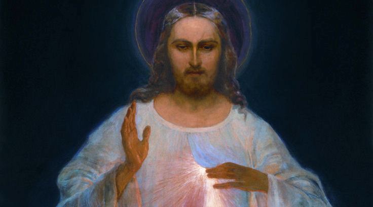
and examine the great painting that St. Faustina commissioned to have painted
based on her visions of Christ coming to her.
There are many versions which have cropped up since the original was
painted back in 1934, but it is the original painting, painted by Eugeniusz Kazimirowski, that transcends.
Last
Thursday I had the great privilege to attend at my Church a private screening
of a documentary on the making of the painting (“The Original Image of Divine
Mercy: A Documentary”) and its convoluted history afterwards. The death of St. Faustina in 1938, the death
of the painter in 1939, the Nazi invasion, World War II, the Soviet occupation,
and the communist repression of religion all caused the painting to be forgotten,
abandoned, and then stored in an attic exposed to outdoor temperatures. It is a remarkable history, which you can
read here, but if you have the chance to see this wonderful documentary, do so. Here is a movie trailer of it.
So
while the original painting fell into obscurity, other painters tried their
hand at St. Faustina’s description in her diary of the Christ of her visions,
and their paintings took root in the culture.
That is why there are so many versions.
Of particular note is the 1943 version by Adolf Hyla, which you can see
on the Wikipedia entry for the Divine Mercy image. For me the Hyla version is most definitely
inferior. It’s less iconography and more
like a cover art for a pop culture magazine.
The right hand is raised less in blessing and more in salutation; Christ’s
face is Hollywoodish, the eyes don’t seem to convey mercy, and the head tilt makes
Christ seem more like a buddy than God.
The more I look at the Hyla version, the more I’m turned off.
So
why am I so attracted to the original Kazimirowski version?
First,
it’s restrained. The simplicity of every
element accentuates the message. There
is very little implied motion. The right
hand is fixed in position of blessing; the feet have come to a stop, though the
position suggests that Christ has come forward.
The tunic hangs still, suggesting stasis. The only motion is reserved for the left hand
peeling open the lip on the tunic at the heart, letting forth divine
light.
Second,
the right arm is in a position of balance and blessing. It is directly level with the left arm, with
the hand up in blessing. Balance seems
so important to the structure of the painting.
The light from the half opened lap reflects off the right hand, glowing
in benediction.
Third,
the dark background from which Christ comes forth is so suggestive. One can read it as the darkness of evil and sin,
or perhaps the darkness of pre-creation, or perhaps the darkness of everlasting
damnation. If the darkness contrasts
behind Christ, then the bright figure of Jesus is the light of the world, the
light of salvation, the light of mercy.
Fourth,
the eye of the viewer is drawn in toward the light from the heart. The lines all lead one to Christ’s heart. The light is bright, natural, and mixed with
red, suggesting the blood and water that flowed from Christ’s side. It is not over done and completely realistic
in the way it points downward as the opening from the garment flap lifts from
the bottom.
Fifth,
Christ’s face is perfection. It is His
face that captures me. It is a
remarkable work of realism. The hair and
the beard are so humble. Hair can
suggest ego and preening. Not here. The beard is scraggly, the hair thin and
modestly placed. It is a peasant’s face, not one of royalty. The eyes are looking down. This might be the most remarkable feature of
the painting. The eyes are not looking
into the viewer’s eyes. They are not
probing you. It is not a moment of
judgement. It is a moment of mercy, of
understanding. Here is a detail of the
head to mid body.
Jesus,
I trust in you.
Update April 5th, 8:09 AM:
Great article by Paul Jaskunas in First Things Magazine on St. Faustina, the documentary, and the painting, here.
Update April 5th, 8:09 AM:
Great article by Paul Jaskunas in First Things Magazine on St. Faustina, the documentary, and the painting, here.

.jpg)

What a wonderful story. Thank you, Manny, for bringing it to our attention. Do you have a link to the full documentary, please?
ReplyDeleteGod bless.
No, unfortunately I don't think it's available on the internet. It's probably something you have to buy.
DeleteThat has always been my favorite version also. I agree, much less fanciful addition.
ReplyDeleteI've been looking at the other versions, and I'm finding them repulsive. Thanks Kelly.
DeleteThis comment has been removed by the author.
ReplyDeleteThis comment has been removed by the author.
ReplyDeleteI love this... deep colours, a reflective expression on Christ's face, the light seems to imminate from His chest. It is a subtle painting which rings true
ReplyDeleteI thought you would like that Melanie. Thanks for stopping by.
Deleteit was a wonderful chance to visit this kind of site and I am happy to know. thank you so much for giving us a chance to have this opportunity.. painting service near me
ReplyDeleteThis comment has been removed by a blog administrator.
ReplyDeleteThis comment has been removed by a blog administrator.
ReplyDeleteI think this is definitely an amazing project here. So much good will be coming from this project. The ideas and the work behind this will pay off so much. malen nach zahlen personalisiert
ReplyDelete